Open MyFitnessPal. Open Carbon. Open Shotsy. Look at the color palette. Soft greens, friendly oranges, rounded illustrations of vegetables and water bottles. The visual language says: we built this for someone gently exploring their wellness journey.
That isn't our user. Our user is a 38-year-old running a $450/month health spend, manually typing values into Excel because his TRT clinic's app can't keep up. He doesn't want a friendly green leaf icon. He wants a number, on a dark background, in a monospace font that says: we got the math right.
So Regimio is dark. And green. And mono. Here's the rationale.
The canvas: #0A0A0A
Not pure black. #000000 looks like a switched-off OLED · too harsh, no atmosphere. #0A0A0A is "off-black" · enough warmth to read as a deliberate surface, dark enough to disappear when the user focuses on the data.
This is the same value WHOOP uses. It's the same value the Oura iOS app uses for its dark theme. It's not a coincidence. It's what works.
The card: #141414
One step up from canvas. Cards float visually. The contrast against #0A0A0A is just enough to define a surface without creating a hard border. Add a single-pixel #1A1A1A border and the card reads as raised without needing a shadow.
The accent: #00E676
Electric green. Not the "wellness mint" of MyFitnessPal. Not the "gym bro green" of fitness apps. The exact hex value of a Tesla regen-brake indicator. The exact hex of an OLED status LED on a piece of high-end audio gear.
It says: this is precision equipment, not a hobby app.
The accent appears in:
- The Today summary stat row
- The "next dose" countdown
- The privacy badge (a 1.5px dot)
- Active states on tabs and buttons
- Active row on the body map
- The brand mark's V · a vertical accent stroke on the wordmark
It does not appear in:
- Warning states (we use
#EAB308yellow) - Error states (we use
#EF4444red) - Success confirmations (we use a slightly desaturated
#22C55E)
The discipline is: accent green = Regimio's state. The system states use their own colors.
The text: #FAFAFA
Off-white. Pure white on a dark background creates eye fatigue. #FAFAFA is the off-white most modern dark themes converge on. It's the value used by Tailwind's text-white, by Notion's dark mode, by ChatGPT's dark interface.
Secondary text uses #888888 · a mid-gray that reads as supporting without disappearing on #0A0A0A.
The fonts: Inter Tight + JetBrains Mono
Inter Tight is a tighter, slightly more compressed cousin of Inter. The compression matters at small UI sizes · Regimio's data-dense screens use a lot of 11–14 px type, and Inter's natural width feels loose at those sizes. Inter Tight reads as more "engineered."
Weights used: 300 (rarely), 400, 500 (default), 600, 700, 800 (headlines only).
JetBrains Mono is the mono. Used for:
- Lab values (
Total T: 1024 ng/dL) - Dose math (
5 mg ÷ 2 mL = 2.5 mg/mL) - Countdown timers (
3h 22m) - Score values (
87) - Date stamps in tight UI
- Eyebrow labels and "tag" chips at small sizes
Mono communicates precision the same way #00E676 communicates state. It's a non-decorative choice. The biomarker 1024 ng/dL displayed in Inter would feel like a marketing claim. In JetBrains Mono, it feels like a measurement.
What we learned from performance apps
Look at the best performance-tracking apps. The visual language is:
- Dark canvas
- Numbered rings as hero metrics
- Modular cards floating on the canvas
- Mono numbers for hero stats
- A single disciplined accent color
- No gradients, no glass effects, no illustrations of activity
We use that design vocabulary because it is widely understood by the exact demographic Regimio targets · high-spend, data-aware, anti-wellness-pastel users who already pay for precision trackers.
The cousin precedent is the Oura ring app. Oura's app is darker and more minimal than WHOOP's, with a similar mono-numbers aesthetic. Both signal the same thing: precision instrument, not lifestyle journal.
What we explicitly didn't do
- No illustrations. No pill bottles, no stethoscopes, no characters demonstrating their stack. Charts and numbers are the hero.
- No wellness icons. No leaves, no hearts, no smiling faces. Vector icons are functional · syringe, beaker, body, ring, chart.
- No gradients on text. Reads as marketing. Reads as not-trustworthy. Hero number "87" is solid
#FAFAFA. - No glass / blur / frosted surfaces. Reads as iOS UI from 2020. Cards are flat.
- No light theme. v0 ships dark-only. v2 considers a light theme if users explicitly ask. They haven't.
How the tokens get used
Every surface in the app uses one of seven base tokens:
canvas: '#0A0A0A'
card: '#141414'
border: '#1A1A1A'
text: '#FAFAFA'
textSecondary: '#888888'
accent: '#00E676'
ok: '#22C55E'
warn: '#EAB308'
err: '#EF4444'
These are locked in src/theme/tokens.ts and the website uses the same values (you're looking at them right now). When we ship v1 and add new surfaces, the tokens don't grow · the same nine values cover everything.
This is the kind of constraint that makes designs feel coherent without anyone consciously noticing. Every screen reads as part of the same product, because every screen uses the same five primary colors and the same two fonts.
The wordmark
Regimio · the small i in the wordmark is rendered in the #00E676 accent. It's the same shape as a standalone i, but its color makes it the visual anchor.
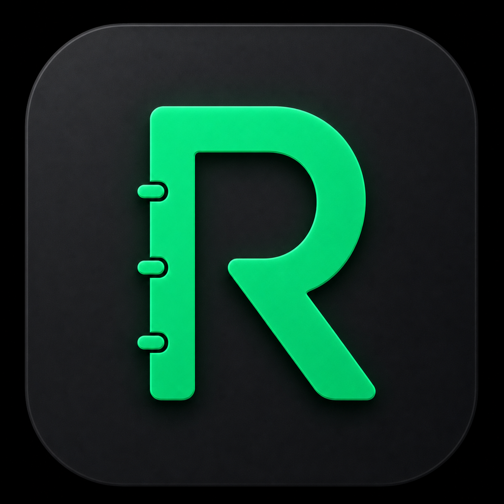
The mark · used as favicon, app icon, social avatar · is a thick R shaped like a tracking notebook. The binder tabs on the left signal daily logs, protocol notes, and repeatable tracking without turning the icon into a medical symbol.
The mark uses the same #00E676 accent and dark canvas as the app. It needs to read clearly at 29px on a phone home screen and still feel premium at App Store size.
Why this matters for the app, not just the website
Design tokens are a tax on inconsistency. Lock them at v0 and you don't have to argue about them at v5. Lock them publicly · in a blog post, in a press kit, in the brand page · and you don't drift even when the team grows.
If we ever change the canvas to #1A1A1A or the accent to a different green, that change has to clear a public audit. The receipts make us accountable.
The whole press kit is here with downloadable assets. And if you want to see the tokens in motion, try the beta.